All Blogs
Best Resume Colors for 2026: 7 Best Choices with Hex Codes
Discover the best resume colors for 2026 to look professional, reflect your personal brand, and stay ATS-friendly — with real examples.
Using color doesn't interfere with how an ATS sees your resume – the current algorithms only read the text layer. According to the University of Minnesota's ATS guide, anything that breaks the parsing process is purely structural – tables, columns, text boxes, graphics, headers, footers, etc.
Quick Summary
A resume can include colors in 2026, but don't go overboard. The most appropriate professional resume colors are navy blue, charcoal gray, black, and an accent color could be used for highlighting your name and headers, but all body content must remain black text on a white background.
You can use 2 or 3 color schemes, depending on how conservative your field is, while creative fields can go bolder. Note that color will have nothing to do with an ATS being able to parse your resume.
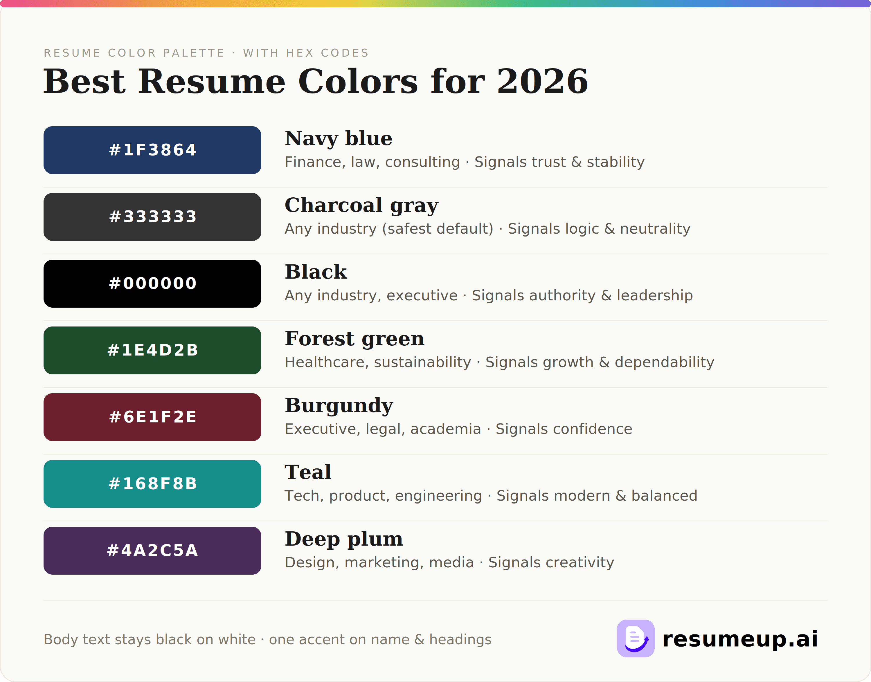
Best Resume Colors At A Glance
Color | Hex Code | Best For |
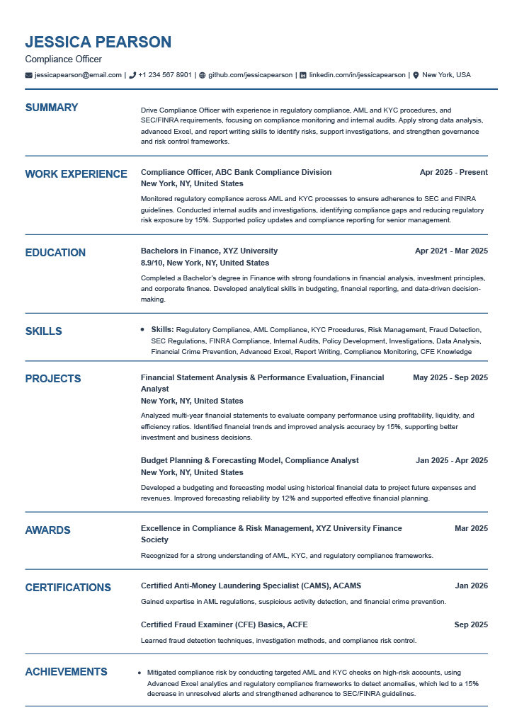
Navy blue | #1F3864 | Finance, law, consulting |
Charcoal gray | #333333 | Any industry (safest default) |
Black | #000000 | Any industry, executive |
Forest green | #1E4D2B | Healthcare, sustainability |
Burgundy | #6E1F2E | Executive, legal, academia |
Teal | #168F8B | Tech, product, engineering |
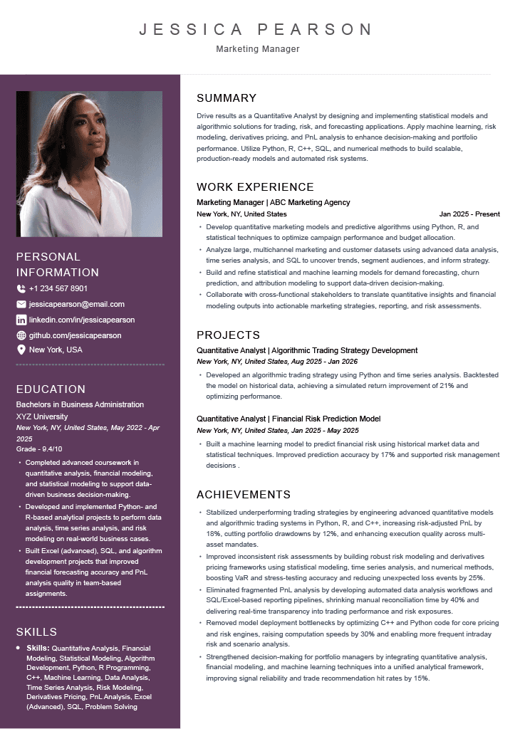
Deep plum | #4A2C5A | Design, marketing, media |
Should Resumes Have Color?
Yes - professional use of color accents is acceptable in 2026 and usually helpful. If done right, it will help your resume catch a spot faster in a stack without hurting readability.
Twenty years ago, using any color was considered inappropriate and unprofessional. Now, both ATS resume checkers and recruiter's expectations changed on your resume - using a restrained accent is standard advice.
Rule: Colors are for organizing the document, not for decorating it. One accent on your name, dividers, and headers is enough; body text and your main resume font stay in black & white.
A subtle accent resume color can help your resume project creativity and personality. But what are the unspoken color rules as per the industry? Let's figure it out.
In Creative Industries: More Freedom
Creative industries allow flexibility with brighter accents. The following are strong options: teal, emerald green, coral, and plum – accents that will enhance rather than overpower your resume.
This applies to industries such as advertising/marketing, graphic design, music, arts, content, and product design. Matching your accent color with the brand color of your target company works well.
https://app.resumeup.ai/resume-builder/83c7cc84-e9b0-4e68-a8eb-2300b0df1b6b
In Formal Industries: Stick To Tradition
Formal industries prefer traditional shades. Choose navy blue, black, forest green, or chestnut brown as a singular accent – shades that project professionalism and readability at once.
This applies to industries including tech, banking and finance, corporations, academics, executives, and most governmental health care fields. If you're ever in doubt about formal industries, a clear black-and-white resume is the strong choice.
https://app.resumeup.ai/resume-builder/e3a3cecf-5251-4223-a256-29683fe13230
What Are The Best Resume Colors? (Hex Codes)
The best colors for your resume are navy blue (#1F3864), charcoal gray (#333333), and black (#000000) - used as a single accent on your name, headers, and dividers, with body text in black & white. Other strong choices include forest green, burgundy, teal, and deep plum, depending on your industry.
What Does Each Resume Color Signal?
Each resume color signals a specific trait: black signals leadership, blue signals trust and teamwork, gray signals logic, green signals stability, red signals power, and plum or teal signals creativity.
Conservative Color Patterns
Black resume choices are more common, but you can have great combinations with other font colors. These black-colored resume designs are authoritative and show your powerful personality.
Blue color reveals your calm and confident personality. Particularly for fintech or corporate firms, these resumes are a perfect match.
Green resumes are also designed mainly for traditional industries. It signifies wealth and money, safety, or stability.
Gray signals logic and analytical thinking. However, charcoal gray would be best suited for positions that require logical reasoning, such as engineering and finance.
Off-Beat Color Patterns
Red: Red, as a color combination for your resume, is enough to seek attention from recruiters. It defines vibrancy, boldness, and passion for the job role. However, remember the red thematic resumes may not be a fit for formal sector companies. You can try them out for the entertainment, marketing, and sales sectors.
Orange/ Yellow resume formats for those who want a less expressive choice. They reflect positivity, sociability, and creative aspects. For freelancing, sports, travel, or relatable fields, you can try the resume colors.
Plum/ Purple signals creativity and originality. So, for the marketing and fashion industries, you can build your resume with these rich colors.
What Are The Best Resume Color Schemes?
The best resume color schemes pair a primary color with a dark neutral and one optional accent. The top three choices are Classic Navy (navy + charcoal + steel-gray accent), Charcoal Neutral (charcoal + medium gray + black), and Slate + Teal (slate + charcoal + teal) for modern and tech roles.
Use the primary for the headings and your name, neutral for the body text, and optional accent for dividers. Never use more than three colors in a resume.
Scheme | Best For | Primary | Neutral | Accent |
Classic Navy | Finance, law, consulting | Navy #1F3864 | Charcoal #333333 | Steel gray #7F8C9B |
Charcoal Neutral | Safest universal default | Charcoal #2B2B2B | Medium gray #595959 | Black #000000 |
Slate + Teal | Tech, product, engineering | Slate #34495E | Charcoal #333333 | Teal #168F8B |
Do Resume Colors Affect ATS Systems?
No. The resume colors don't affect the ATS parsing. A resume parser scans the text portion of your resume, not its visual aspect, which means that both navy and black headers will be interpreted in the same way. What messes up parsing? It’s anything from text embedded into pictures to columns and headers/footers.
What actually breaks the parsing is structural, not visual
Text in image form - parsers read the text rather than the image, so text within the image is stripped.
Text boxes and multiple-column documents are frequently omitted or appear out of sequence.
Header and footer content – parsers can choose to disregard header and footer sections, so important information may be overlooked.
Unique font styles or unusual file formats beyond common .docx and .pdf files.
What Color Should Your Cover Letter Be?
Your cover letter should use the same color as your resume because both come under a single package, which needs consistency. The color used for the main body of the letter should be a neutral color such as dark blue, black, or gray. Carry along the accent color of the resume to the cover letter’s header section without incorporating contradicting colors. With the help of a cover letter generator, you don't need to worry about matching it with your resume.
Since the cover letter is the one where you present yourself, the design should enhance your presentation. In teaching, recreation, and education fields, it is possible to include a soft pastel accent such as teal or coral.
Conclusion
Your choice of color will not be the reason for getting a job, but it is responsible for leaving the first impression before the reader even starts reading the document. It would be best to use black, navy blue, or charcoal as a single accent only on your name and headings, with text remaining black on white paper for conservative fields, while for creative roles, teal, plum, or coral helps to show personality.
It's a time-consuming process to find out the templates and color schemes. But with an AI resume builder, you can do all of this in minutes. Pick a template, choose a palette that fits your field, and change the color to match your accent.
Frequently asked questions
How do resume colors affect ATS systems?
ATS does not have difficulty with colored text – what is important is having good contrast between colors. High-contrast combinations include black or navy text on a white background; you should not use light-colored text on a light background. The elements that will definitely ruin parsing are those that are textual but placed inside an image, on a colored background, in columns, or in headers/footers.
What are the most professional resume colors?
The most professional resume colors are navy blue (#1F3864), charcoal gray (#333333), forest green (#1E4D2B), and black (#000000). These colors convey professionalism, reliability, and competence. For creative fields, teal (#168F8B), burgundy (#6E1F2E), or deep plum (#4A2C5A) add personality while staying professional.
How many colors should I use in my resume?
For a professional resume, it's best to use a maximum of 2-3 colors. A primary color for main text (typically black or dark blue), a secondary color for headings or section titles, and possibly an accent color for highlights or important information. Using too many colors can make your resume look unprofessional and distract from your qualifications.
Should I use different colors for different sections of my resume?
While you can use different colors for different sections, it's important to maintain consistency and professionalism. A common approach is to use a neutral color (like black or dark gray) for the main text and a slightly different color (like navy blue) for section headings. This creates visual hierarchy without being distracting. Avoid using bright or neon colors, and ensure all colors have sufficient contrast with the background for readability.
Do different industries prefer different resume colors?
Yes, different industries often have different color preferences. Traditional industries like finance, law, and healthcare typically prefer conservative colors like navy blue, black, and dark gray. Creative industries like marketing, design, and media may be more open to slightly bolder color choices like teal, burgundy, or deep purple. Research your target industry and company to understand their color preferences and adjust your resume accordingly.
Is it OK to use color on a resume in 2026?
Yes. An accent color used for your name, headers, and dividers in 2026 is considered normal, as long as body text is still in black on a white background. Use a restrained accent to pay attention to details and make your resume more distinctive without hurting user readability or ATS parsing.
How do I choose colors that match my personal brand?
Are there any colors I should avoid in my resume?

Rohith Reddy
Co-Founder
Rohith co-founded ResumeUp.AI after a decade building software and hiring engineers. He graduated from IIIT in Computer Science, then worked at ADP, YuppTV, and Paperguide — leading teams and conducting 500+ technical interviews as a hiring manager. He writes from both sides of the table: what recruiters actually look for, and what the candidate side of the resume actually feels like.